
3Commas
Automated trading without losing expert control
- Role
- Senior Product Designer
- Result
- Activation rate+27%

One long form served people with very different needs. I gave them three ways into the same bot, chosen by how much control they want, and DCA bot activation rose 27% across all segments. I owned the design end to end, from research to launch, with PM and engineering, and gathered the product data myself.
Context
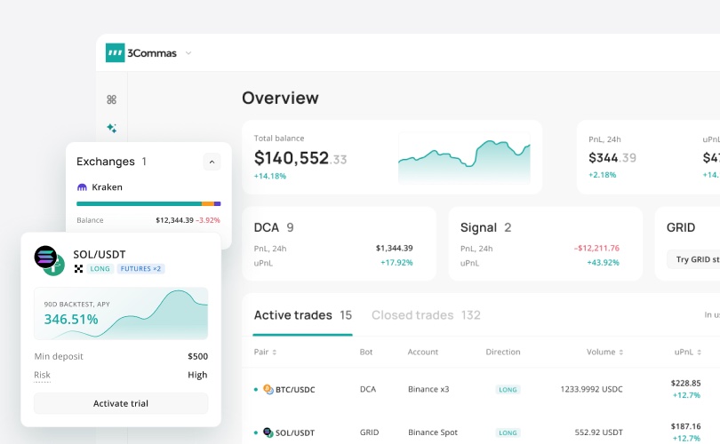
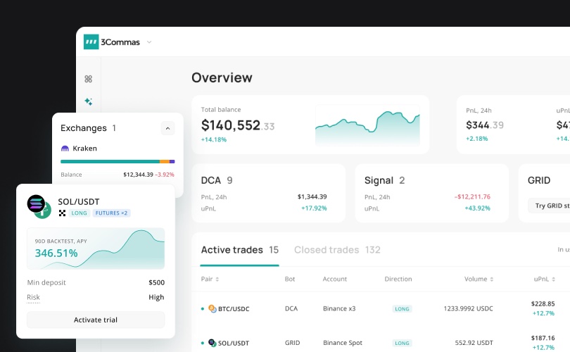
3Commas connects to your exchange over an API and places orders on it, with real money on a live market. A DCA bot runs a strategy: entry orders, order size, safety orders, take profit, stop loss. The audience runs from first-timers to pros, on web and mobile, with many linked settings.
Problem
One form asked everyone for everything. A beginner had to make advanced choices before understanding the strategy, and a pro just wanted speed and full access. So people left before starting their first bot, or launched one with errors.
- Too many decisions before any value
- Jargon, with basic and advanced settings mixed together
- The backtest was hidden, so consequences showed up too late
- Getting to a running bot took too long
The picture was clear: the same goal, very different control needs, and a form that felt unfamiliar to beginners, which hurt how quickly they could adapt. So I grouped people by how much control they want: four segments across three entry points.
| Segment | Entry point |
|---|---|
| New to trading | Ready-made preset, then quick start |
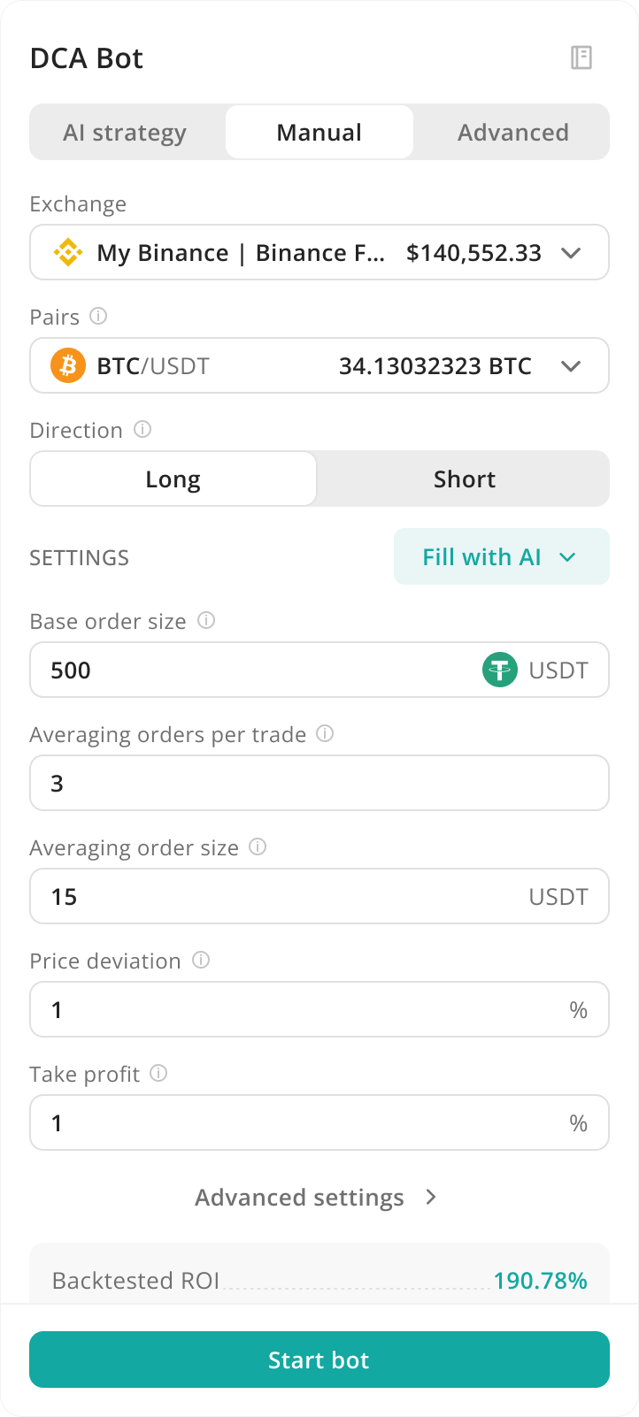
| Intermediate traders | Manual |
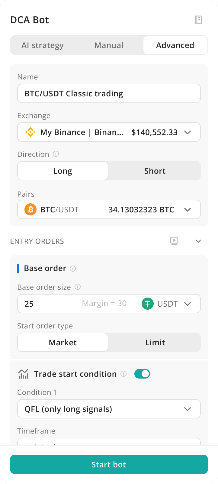
| Pro traders | Advanced |
| Managing many portfolios | Advanced |
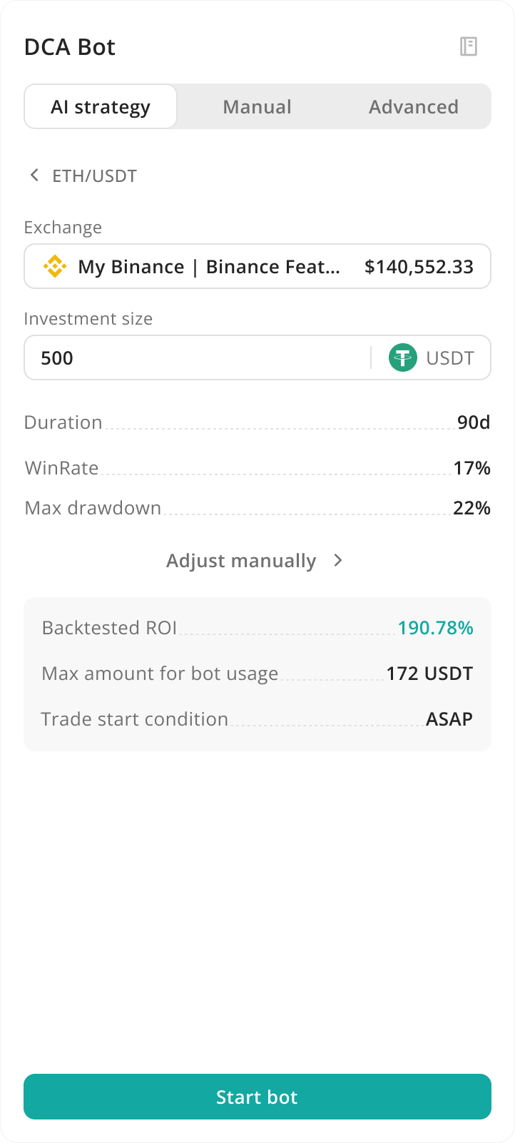
The beginner path runs ready-made preset to quick start, and from a preset you can drop into the full form to fine-tune.
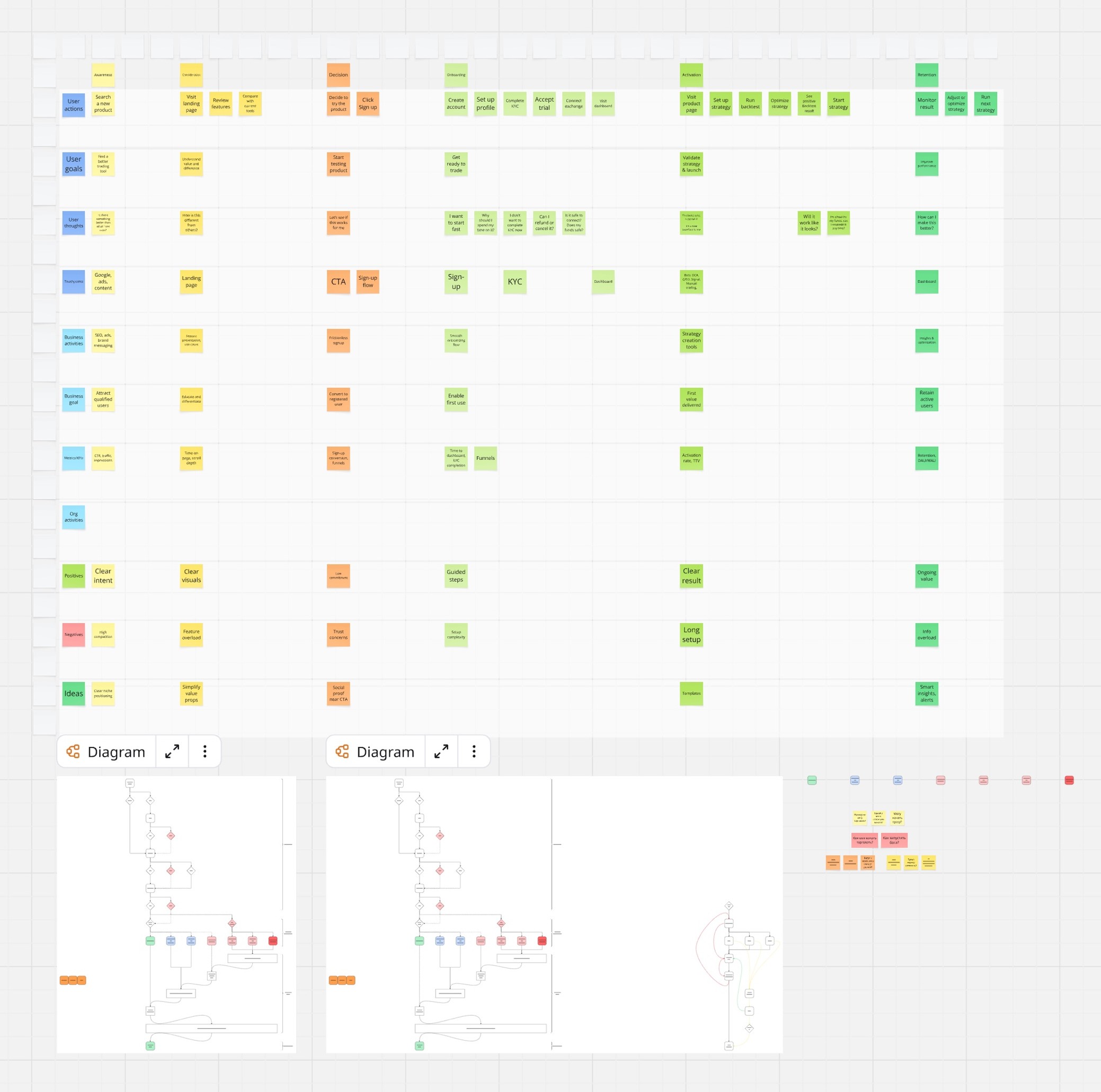
Customer journey map
The funnel from awareness to retention, tied to user actions, goals, thoughts and metrics. The negatives row is where the pain sits: trust concerns, feature overload, and a long setup.
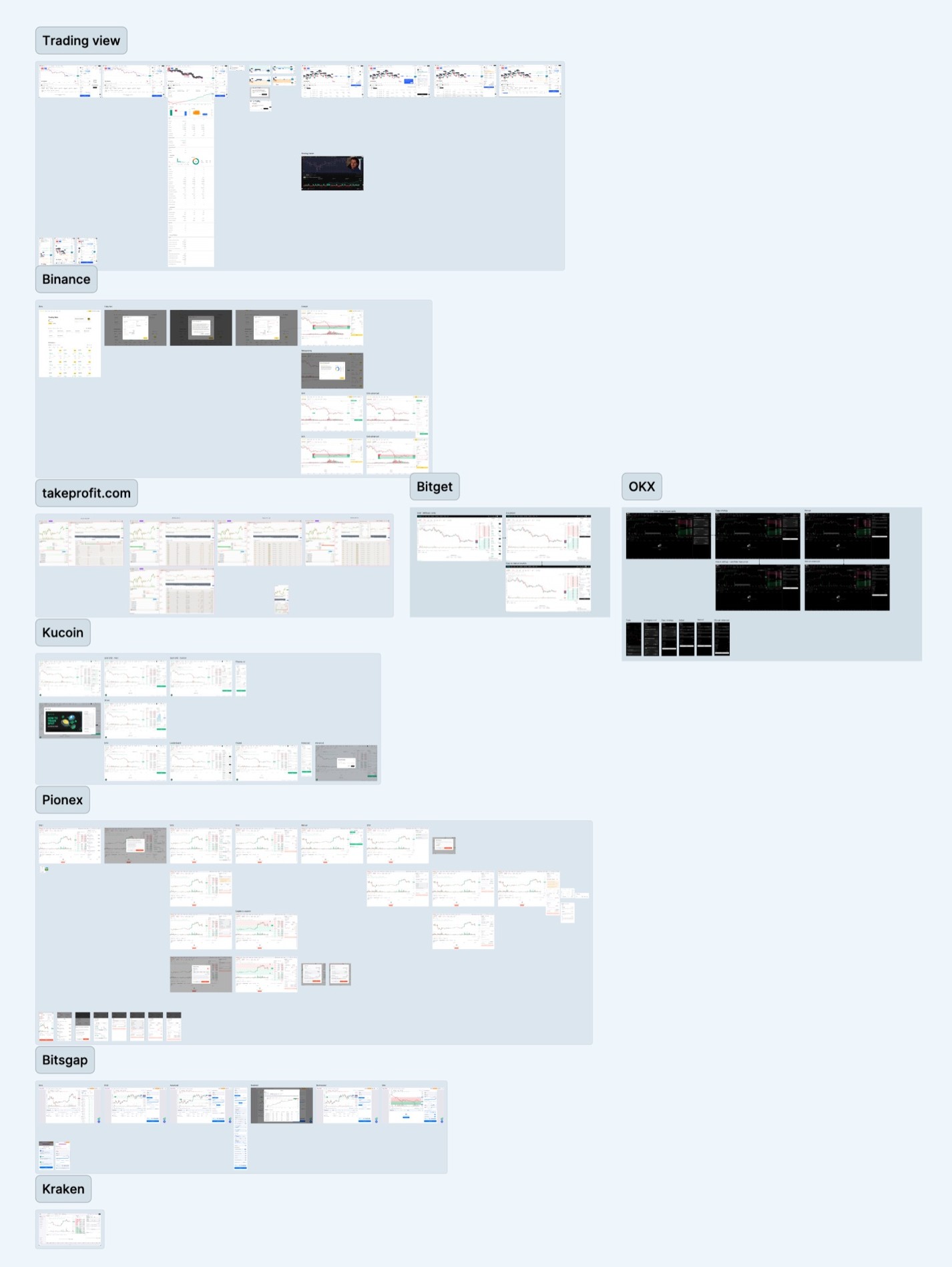
Competitor analysis
I mapped layouts and best practices, then took the patterns traders already know.





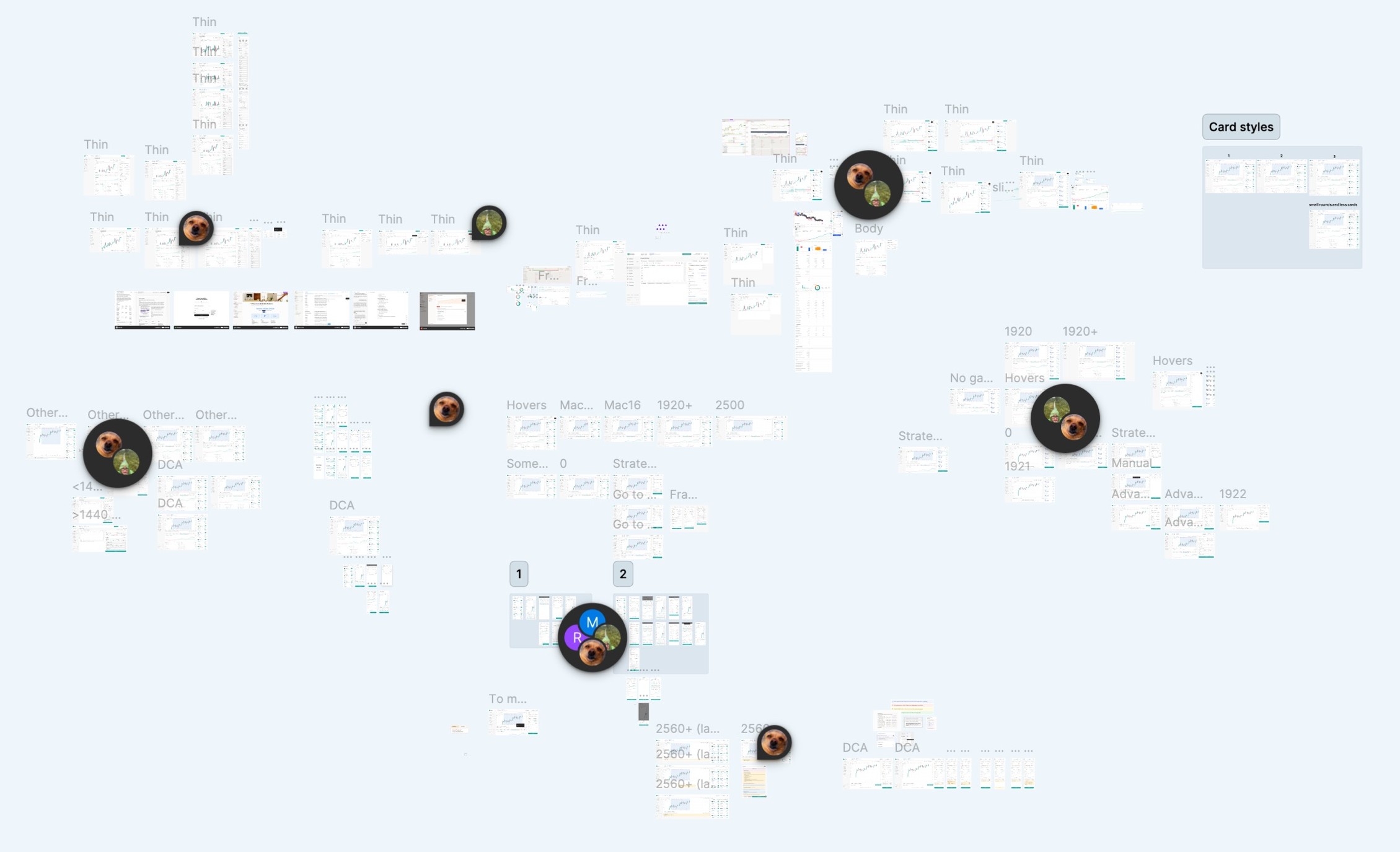
Concept work
Where the direction came from: layout options, card styles, breakpoints and states, explored before landing on the three entry points.
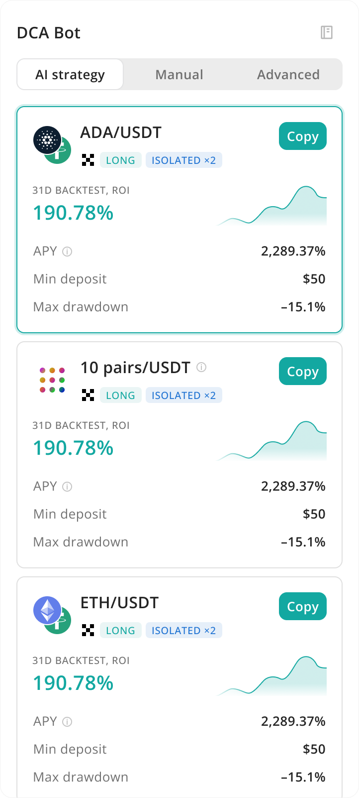
Solution
One bot, three entry points. I weighed a single simpler form and several layouts and ways into the form states, but chose three ways into the same bot: beginners get an easy start, pros keep everything.


The layout stays close to the exchanges and trading terminals people already use, drawn from the competitor analysis, so it fits the category. To help newcomers adapt, I reworked the copy from the same analysis, so labels read in familiar terms instead of platform jargon.
Two things it took testing to get right:
- People did not trust the strategies, so I made the backtest visible from the start. Seeing the backtest run became the aha moment and carried the value across segments.
- People worried they would lose their work when switching modes, so every form state is saved locally and the form reopens where you left it. Existing pros can also switch back to the familiar form.
The path differs by entry point, but the build never dead-ends.
Flows & edge cases
Every awkward state has a defined response: a missing exchange connects inline, low funds show the required balance, an unsupported pair explains itself, the backtest refreshes on its own, and after launch you get a clear status.
| State | Design response |
|---|---|
| No exchange yet | Connect it inline, without leaving the flow |
| Insufficient funds | Show required and available balance |
| Unsupported pair | Filter the preset list by pair, and explain when blocked |
| Outdated backtest | It refreshes on its own, so what you see is current before you launch |
| After launch | Clear status, plus jump straight to the bot or stay on the form |
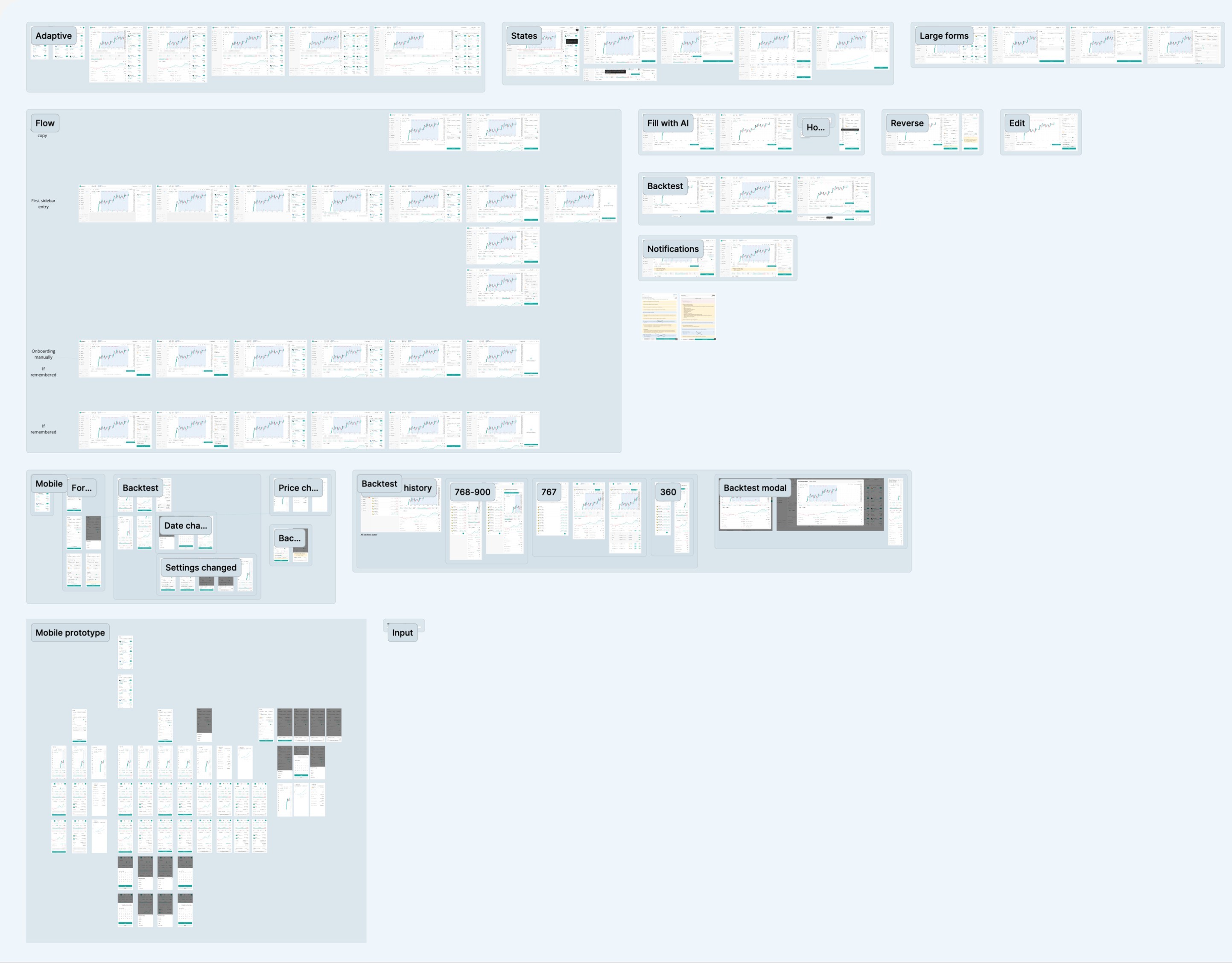
Full flow and adaptive
The whole builder mapped end to end: the sidebar and manual entries, states, the AI fill, backtest and notifications, plus the mobile adaptive across breakpoints.
Impact
Activation here is the share of people who open the builder and launch their first bot, measured across all segments in the weeks after launch. It was the design goal. Subscriptions also rose 5% in that period, and this work was one of the drivers.
Insights
Ask about control, not experience. People rate their own level poorly, and what they want is really more or less control.
Simple does not mean fewer features. I kept them all, and only changed the order they appear in.
In money products, show the result next to the setting. The visible backtest did more than any copy.
More from 3Commas
Two more pieces of this work: an onboarding redesign that lifted new-beginner activation +60%, and an AI assistant taken from zero to one (24% from chat to a created bot, 32% to a first action).
 3CommasFull case study